Lock-In: Living Colour
Series 3, Episode 1
Hosted: 03/02/2021 07:00:00 pm
This week, the Expert Lock-In returned for the third series, and we started as we meant to go on.
Big hitters Johnstone’s returned but in a whole new light (more on that later). In contrast to previous appearances, this one was all about colour. Flanked by Account Managers, Gareth Jones and Kieran Patel, we brought on Johnstone’s Technical Colour Consultant, Donna Taylor.
With two decades (and counting) of working in the paint industry, Donna’s knowledge was invaluable.
Right, let’s open up that tin of paint.
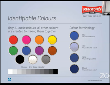
Turn It Up To 11
Do you know your hues from your tints? Your tones from your shades? Naturally, the first step in any conversation about colour is finding out what it all means. Here’s some of the basics:
Hue – The perceived colour
Tint – A Hue with white added
Tone – A Hue with grey added
Shade – A Hue with black added
Nuance – Relates to The Grey Scale Indicator and the lightness & darkness value of a colour.
Often on tins of Johnstone’s paint, there’s a number on the back representing the Light Reflectiveness Value (LRV) – measured between 0%-100%.
If a colour has a an LRV of 0%, it is the perfect black and absorbs all light. In contrast, 100% is the perfect white and reflects all light. Colours between 40-70% are known as mid value.
Knowing the LRV allows you to identify which type of colour is better suited to specific rooms. Dependent on your desired effect and the amount of light that enters the room – knowing the LRV of a paint is a good starting point in designing your colour scheme.
The Psychology of Colour
Creating a beautiful and meaningful space has a positive impact on the morale and mood of tenants. It’s vital to choose the correct colours and create the required ambience that tenants are searching for. Looking at it from the bottom-line perspective, done right and you’ve got the opportunity to market your property on more than simple square footage.
So which colour does what? Unfortunately, we don’t have the page space to go through each individually. But green provides a balanced mood, invoking feelings of nature. Grey is timeless, blue is calming, and red incites feelings of passion.
Colour with caution though. Often, the positive impacts of a colour can be counteracted by a slightly different shade. For example, vibrant yellows can produce feelings of increased self-esteem and optimism, but paler shades can put your confidence in the mud. Like so many elements of property design, it’s about striking a balance and knowing your audience.
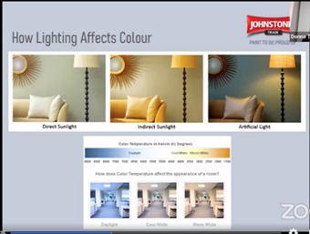
It’s All About The Lux
Naturally, natural lighting isn’t the only source of light in a room. However, the orientation of a room affects the entry giving you three different colours for the price of one. As was shown in the webinar, different exposures to the sun combined with artificial light result in an array of shades.
In north facing rooms, light is less direct throughout the day, creating a consistently colder feeling. However, this can be compensated by warmer colours being used that absorb the natural light.
In contrast, more light travels into the space throughout the day in south facing rooms. If you don’t want the room to feel overly energetic, it’s advised to offset the sunlight by going with softer, cooler hues of calming colours.
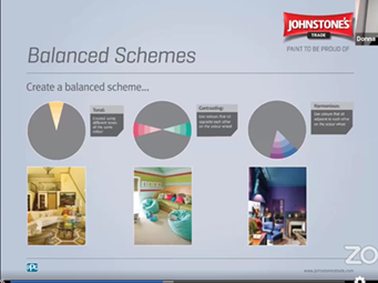
The Grand Scheme of Things
Ok so the space, orientation and size has been established. How do you select a colour scheme? Once you have the decided the ambience you want to create, the colour wheel is a useful tool starting point.
One half of the wheel has warm colours that excite, whereas the other has colours that calm and soothe. There are three methods to creating a balanced colour scheme using the wheel
Tonal – Created using different tones of the same colour
In a tonal scheme, deeper colours are better used nearer to the floor level, and lighter colours towards the ceiling. This provides better light reflection and an illusion of space which is a very important quality in your properties.
Contrasting – Colours that are opposite each other on the colour wheel
Unsurprisingly, applying opposite colours in a space creates a dramatic effect, but it should be approached carefully. You shouldn’t apply the colours in equal amounts, otherwise they clash and fight for attention.
Harmonious – Adjacent to each other on the wheel
Unlike the contrasting scheme, colours in this scheme can be of a similar depth and achieve a balanced look without overpowering each other. A more dramatic feel can be achieved using deeper and more intense shades.
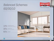
The Winning Formula
Once the colours have been selected, even distribution is key. But it’s not just about the paint on the walls. To create an accomplished finish, the colours need to fit with all design elements of the room. For example, flooring, fabrics and accessories play a key role in colour distribution.
Donna’s advice for effective results is by following the 60/30/10 rule. In this formula, up to 5 colours can be used and ideally should include as much of the space as possible.
The 60% colour space is the most dominant surface area in the room. It could be ceilings, floors, large scale statement fabric pieces or furniture.
The 30% surface area is the intermediate colour – ceilings, feature wall, rugs, curtains and blinds.
The 10% space is the smaller elements such as trim/woodwork, cushions, pelmets, accessories etc.
To produce the most effective results, Donna recommends repeating the 30% or 10% colour space at least once in the room.
And that’s your lot! You can learn more about Johnstone’s here.